EvidMind Academy
Turning a broad consulting offer into a clear, credible path for entrepreneurs ready to structure and grow their business.
The context
EvidMind Academy supports entrepreneurs, business leaders and project owners through strategy, structuring, management, commercial development, franchise preparation and applied AI. The website acts as both an institutional introduction and an entry point into its programmes.
The initial challenge
The offer spans several stages of company growth and several areas of expertise. The central challenge was to organise that breadth without diluting the positioning, while giving prospective clients enough context and reassurance before inviting them to book a conversation.
The audience
Entrepreneurs and leaders looking for structured guidance. They need to understand who the academy helps, where its expertise applies and what a first step looks like before committing to a conversation.
Objectives
Every objective tied
to a decision.
Establish credibility
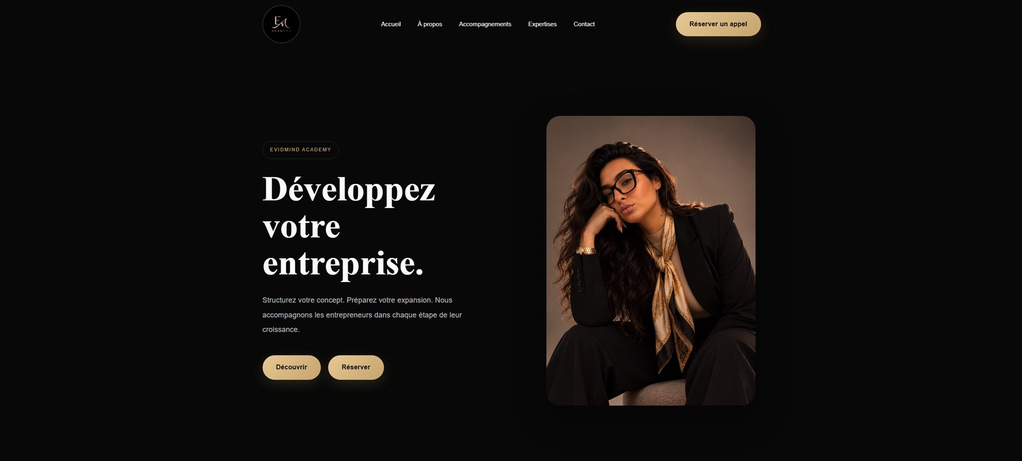
A restrained dark and gold visual system creates a consistent institutional frame.
Clarify a broad offer
Dedicated pages separate programmes, expertise, AI and company information.
Create a direct next step
Calls to action connect discovery content to a Calendly presentation call.
Support organic discovery
Unique metadata, semantic headings and structured data provide sound SEO foundations.
A journey designed
to build confidence.
- 01
State the growth promise
- 02
Introduce strategic pillars
- 03
Explain programmes and expertise
- 04
Present the franchise accelerator
- 05
Demonstrate the method
- 06
Answer common questions
- 07
Invite a presentation call
Creative direction
An identity serving
the positioning.
A near-black foundation, warm gold accents and high-contrast editorial imagery give the academy a controlled, premium presence. Playfair Display introduces authority and editorial character; Plus Jakarta Sans keeps longer explanations accessible.
#080808#111111#181818#C5A46D#E7C894#FAFAFAPlayfair Display / Plus Jakarta Sans


Key interface decisions
Design as a
strategic tool.
Growth-led hero
The opening message focuses on the client’s desired business progression, not on the consultancy itself.
Franchise accelerator chapter
A dedicated visual chapter makes a specialist offer visible without overwhelming the core navigation.
Layered expertise architecture
Programmes, expertise and AI each receive their own route so complex information stays scannable.
Progressive reassurance
Method, testimonials and FAQs appear before the final conversion point to answer uncertainty in sequence.
A foundation built
to last.
Development
A bespoke WordPress theme separates reset, tokens, layout, components, pages and responsive rules. Vanilla JavaScript handles reveal animations and interface behaviour. Images declare dimensions, use async decoding and lazy loading below the fold; the hero image is preloaded as the LCP candidate.
Motion & interaction
Intersection Observer reveals content only when it enters the viewport. Hover feedback supports scannability, while the experience remains readable without motion.
SEO & performance
The implementation includes page-specific titles and descriptions, canonical URLs, Open Graph and Twitter data, image preloading, semantic markup and Organization, WebSite and WebPage schema. No unverified performance score is presented.
Challenges & solutions
Solve with
intention.
A wide service portfolio
Visitors could lose sight of the core proposition.
Content was separated into focused routes and ordered around business maturity.
The offer becomes easier to scan without removing depth.
Premium positioning without distance
An overly corporate interface could feel inaccessible.
Editorial typography and gold accents are balanced by direct language and clear actions.
The experience feels authoritative while remaining approachable.
Rich homepage content
Numerous chapters increase page weight and cognitive load.
Responsive images, lazy loading and reusable cards keep the delivery controlled.
The narrative remains detailed without relying on a heavy animation library.
What this project
taught us.
A broad consultancy offer becomes more persuasive when it is organised around the visitor’s stage of growth. A future iteration could further consolidate repeated homepage sections and validate the content hierarchy through user interviews.
Next case study
SC Body Premium↗